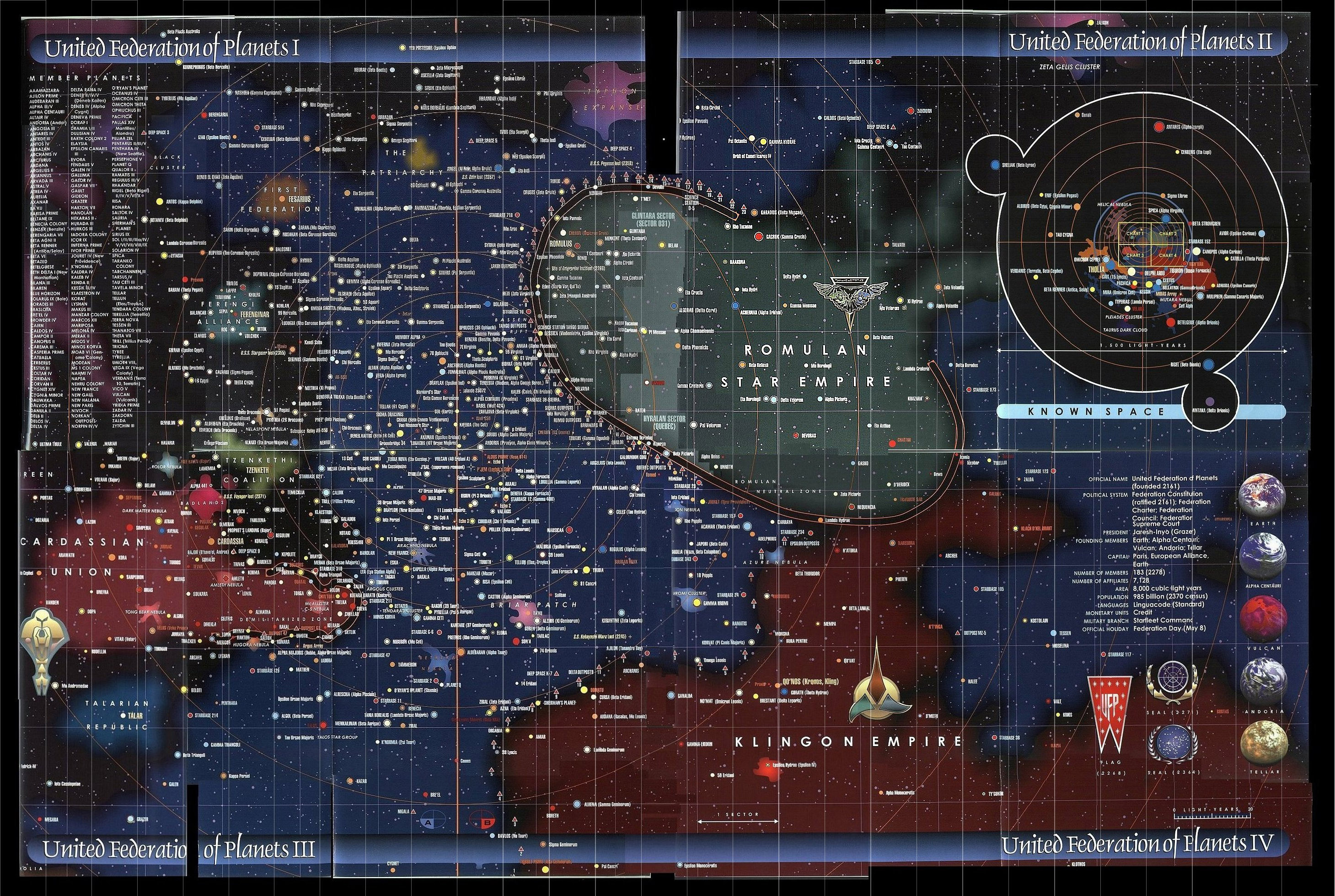
Ever wonder what the world really looks like through someone else’s eyes? Representations of the planet have changed with the times as have the people who made them. These are just a few strange, innovative and/or humorous examples past, present and future.


Ever wonder what the world looked like 500 years ago? It used to be that high-resolution world maps like the one above were kept (at best) in glass cases in museums or (at worse) were secreted away in vaults. Now antique maps are readily available to the world via sites like Wikipedia and are changing the way (and resolution) in which we look at the past.

Ever write or draw maps or directions on your hand? Believe it or not this is nothing new. These gloves were created for the 1850 Great Exhibition in London and enabled visitors to easily find their way. Imagine the possibilities of this in the digital age: an ever-shifting GPS-based glove map that changes orientation and location with the wearer!

 There have been many attempts to ‘map the internet‘ in various forms and with differing degrees of success. Some of these are more convincing than others, such as the first series above that depicts information transfer overlaid on a world map. Some simply make points about the relationships of key internet players in a familiar way, such as the subway map of the internet. Another curious internet phenomenon: here is a list of places blurred out from Google Earth.
 With the past and the present covered, what about the future? Well, scientists have developed a map of what the world is predicted to look like in 250 million years that bears a remarkable resemblance what scientists speculated the world did look like in the equally distant past. This Future World, like Pangea, is a place where all of the continents are again pushed together to form one or two mega-continents. Still want more maps? A great collection of 175 maps spanning 4,000 years
read more | digg story


No comments:
Post a Comment