
I’m excited by artists who are finding ways to adapt the rainbow spectrum in their work. Color is so powerful and can be so striking. The color field (or chromatic abstractionist) artists of the 50’s often painted with bold swaths of color but rarely used as many together as the featured artists of this article. In the 60’s, psychedelic art used colors and patterns together too. The modern artists I’ll cover in this post use color in an undiluted, anything but soft array of graphic lines and shapes resulting in work that is both vivid and alluring. Their work circumvents the boundaries their predecessors put in place to arrive at a new and bold take on prior styles.
Jim Lambie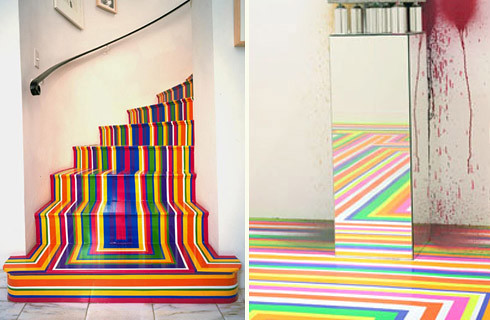
Jim Lambie is represented by the Anton Kern Gallery. Glasgow-based, Lambie uses glossy tape in varying colors to build installations. The vinyl tape, an everyday material applied in continuous lines, transforms the dynamics of space, changing a white box gallery space into an energetic/emotional space of sensory pleasure. To read more about Lambie’s work click here.
Maya Hayuk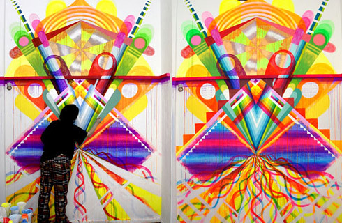
New York based, Maya Hayuk is an artist I first noticed on Fecal Face, they did a great interview with her that is a must read.
Mark Grotjahn
Grotjahn is an artist I found by picking out a beautiful book in a used bookstore the other day. The cover was all rainbow colors, it’s called “Entertainment and art are not isolated. Entertainment is in art like color in pictures”. It’s not a mass market book but rather a compilation of works from a show at the Aspen Art Museum in 2007 with the same name. Here’s more info on that show. Grotjahn’s work was part of it and I was immediately drawn to his colors. I think Helen Frankenthaler would be too.
Architecture too: The MUSAC Contemporary Art Museum of Castilla y León by Mansilla + Tuñón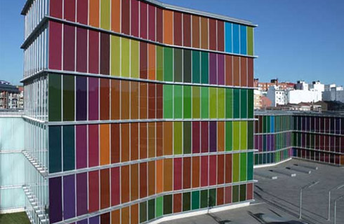
This stunningly colorful museum won the European Union Prize for Contemporary Architecture – Mies van der Rohe Award in 2007. I love the way color is integral to the look of the building. I don’t know that much about architecture but color does not seem to be one of the main focal points when buildings are discussed. It’s unavoidable on this one with it’s translucent colored glass. In fact so striking it trumps all other elements of design.

Mark Rothko
To see some interesting work by the original color field painters take a look at Mark Rothko, my favorite of the lot. If you are in the mood to dance around a fire on mushrooms or sit in a room with a black light and cool psychedelic art of Peter Max look here.

Peter Max
Or if you are interested in learning more about modern color field painting or “Post-Painterly Abstraction” read this broad article from the NY Times entitled “Color As Field: Weightless Color, Floating Free”.


No comments:
Post a Comment